.gif)
.gif)

Data can be complex, hard to understand, and quite frankly— boring. Instead of trying to make sense of the numbers, your audience may find themselves disengaged which will impact how they receive the rest of the presentation. To avoid overwhelming your audience, it’s important to share metrics and statistics in bite-size, digestible chunks. Data visualization can help transform more complex numbers into easy-to-read charts and graphs.
In this article, we share ways Beautiful.ai can help transform boring, complicated data into visual, actionable insight.
Understanding data and its challenges
It’s no secret that data is important. Data helps quantify the performance of your business to help you make more informed decisions about processes, operations, and strategies. It can be used to measure the success of marketing campaigns, sales initiatives, product launches, customer acquisition and retention, and more.
Given its importance, what makes data so difficult to engage with? Common issues with raw data include complexity, volume, and lack of context. It’s hard to grasp key takeaways from oversaturated charts and graphs. And even worse is staring at a table full of numbers with little-to-no context. Sometimes it can feel like you’re staring at a page in a book written in a foreign language.
When leveraged correctly, data acts as a northstar to guide big business decisions like budgets, or weighing the risks of a new business opportunity. But in order to be actionable, people need to know what they’re looking at and how to digest it.
The power of data visualization
Data visualization is important because it breaks down complex data and extracts meaningful insights in a more digestible way. Displaying the data in a more engaging way helps audiences make sense of the information with a higher chance of retention. Using charts and infographics can help reveal insights that are not obvious in raw data. Other benefits of data visualization include:
- Enhances understanding
- Facilitates better decision-making
- Simplifies communication
- Reveals patterns and outliers
- Increases engagement
- Enables data exploration
- Supports data-driven storytelling
Techniques for Transforming Data into Visual Insights
Choosing the right charts and graphs
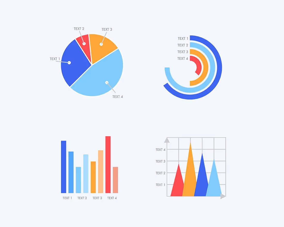
Charts and infographics are the essence of data visualization. They take your most meaningful data sets and display them in more visual ways. However, if you don’t use the right charts, it can have the opposite effect and make your data even more confusing. Understanding your data means understanding which charts will help drive your point home. Don’t panic, our ultimate guide to data visualization can help influence your decision.
Design principles for effective data visualization
In data visualization, the numbers are complex, so the design should be simple. Read that again. Less in more. Each chart or graph should have one key takeaway, and it should be obvious to your audience— don’t send them on an easter egg hunt to figure it out.
Use colors to highlight key points
Colors are your friend. They can help you convey things within your slide more effectively. We suggest using different colors to provide contrast between data sets. Use your boldest colors to represent the more important pieces of information, and more subtle hues to indicate the rest. Colors are an easy way to tell the audience exactly what you want them to pay attention to.
Include supporting visuals
Images, icons, and shapes can help provide additional context for your data. In fact, if some members of your audience find themselves more creative than logical, including the right supporting visuals can help paint a picture for them. While data should be the star of the show in data visualization, certain visual assets can put things into perspective and make them more relatable.
You might also use Beautiful.ai’s Elements for special annotations. You can add additional icons, arrows, or text to call out important pieces of information to craft your message in a more meaningful way.
Be intentional with text
Data visualization is all about painting a picture with strong visual elements, so be intentional with your use of text. You want your audience to focus on the graphs, charts, or percentages on the screen, so don’t distract them with a lengthy paragraph to read. You might need to use bullet points to add context to the metrics, or to call out important aspects of a report, but limit it where you can.
Interactive visualizations
Bring your data to life with dynamic animations. Even despite your best efforts to dress up your data, you might still lose your audience to boredom (it happens). Dynamic animations are subtle movements for when each slide advances, and they’re a surefire way to catch the eye of your audience and pull their attention back to your presentation. You can select the animation style, and speed, so that the data in your graphs and charts build with your story.
Data storytelling
Believe it or not, data tells a story. We know that most people are more likely to engage with your presentation if there’s a strong narrative to back it up, so tapping into data storytelling when presenting your information and statistics can help it land better with your audience. Data storytelling is how you choose to communicate your insights to make them more meaningful and relevant to your audience, and can be used to support your overarching message.
"Data visualization is powerful. Still, data storytelling is the thing driving decision-makers. People take action when they interact with a data-evidenced proof of the story." — Monika Piekarska
What do your reports tell you about your customer, proof of your company’s success, or your missed opportunities? By making your data more actionable, you’re making it easier for your audience to comprehend.
Turning visualizations into actionable insights
Using infographics or charts help simplify the communication of complex ideas and findings. They provide a common language for sharing information, making it easier for different stakeholders to interpret and discuss the key takeaways.
It enables decision-makers to quickly grasp patterns and trends from large datasets, helping them interact with the data, drill down into details, explore different perspectives, and make more informed decisions. This empowers users to uncover new insights and ask more meaningful questions to drive action.
Beautiful.ai for data visualization
Implementing data visualization in your presentation is easier than you may think. Presentation softwares— like Beautiful.ai— offer pre-built presentation templates that allow you to plug and play with your own content. These charts and graphs are fully customizable so you can bring your data to life in just a few clicks. From bar charts and line charts to data comparison slides, there’s something for every story.
Once you choose your chart and add your content, Beautiful.ai’s Smart Slides handle the rest with design best practices in mind. You can easily change the layout, or toggle between different templates, to see what best fits your needs.
Data import and linking
Even if you start with a slide template, data can be tedious, and inputting metrics into a chart or graph can take time. In Beautiful.ai you can import or link to preexisting data for more accurate charts, faster. Keep your data fresh and up-to-date with data linking, or import data to your chart or table directly from your preferred app and choose to link the slide to the data source. When your source file is updated those changes will automatically be reflected on your linked slide. You can import from—or link to—Google Sheets, Dropbox or Box all right from within your presentation.
The ability to import and link data gives you back the time it would take to add metrics manually to each chart or graph in your deck, so you can focus on other aspects of your presentation.


.avif)