
When you don’t know where to take your presentation, Smart Slide templates are a great starting point. The customizable templates use guardrails to protect the design as you add in your content, and can help you reimagine your story. While there are intentional limitations to maintain design integrity, there are so many different ways to customize each layout beyond the default settings.
In this series, we’re highlighting your favorite slide templates, and challenging you to try something new. For each Smart Slide, we’ll showcase different ways to style and format it to help inspire a new way to tell your story.
Gantt chart
A Gantt chart is a visual view of tasks scheduled over time. It's a type of bar chart that you would use to show the start and finish dates of several elements of a project such as what the project tasks are, who is working on each task, how long each task will take, and how tasks group together, overlap, and link with each other.
The unique structure of a Gantt chart gives you high-level visibility into projects with multiple stakeholders and dependencies. Keeping the roles and responsibilities outlined in one organized chart leads to better productivity and team collaboration.
Gantt design tips
A Gantt chart is fairly simple by design, but here are five ways you can change the layout of your slide for bigger impact.
Add a sidebar
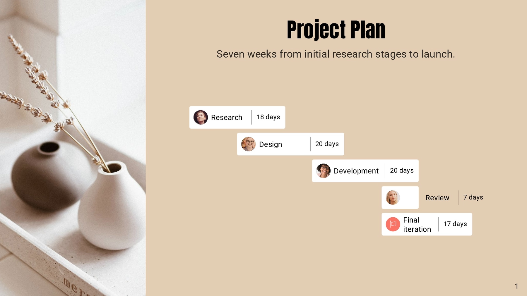
For a more engaging design, you can opt for a sidebar on either side of your Gantt chart. The sidebar is fully customizable, and can house video, image(s), text, or a combination of all three. By adding a sidebar with a supporting visual, you’re encouraging your audience to focus on the slide and retain the information within your chart.
Use different colors for variation
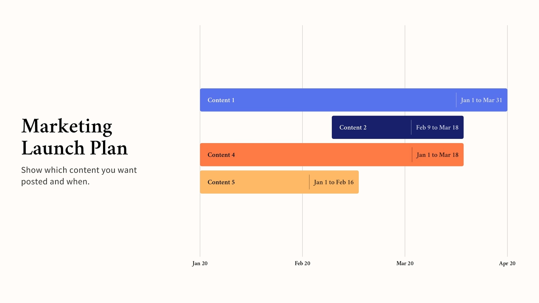
In an otherwise plain slide, thoughtful color combinations can add variation and dimension. Using contrasting colors can help differentiate tasks, project owners, and deadlines to make the chart more digestible at a glance. How many colors you use and how you assign them is up to you.
You can also play around with solid, gradient, or image backgrounds to add some flare to your slide design (keep legibility in mind, though).
Set milestones
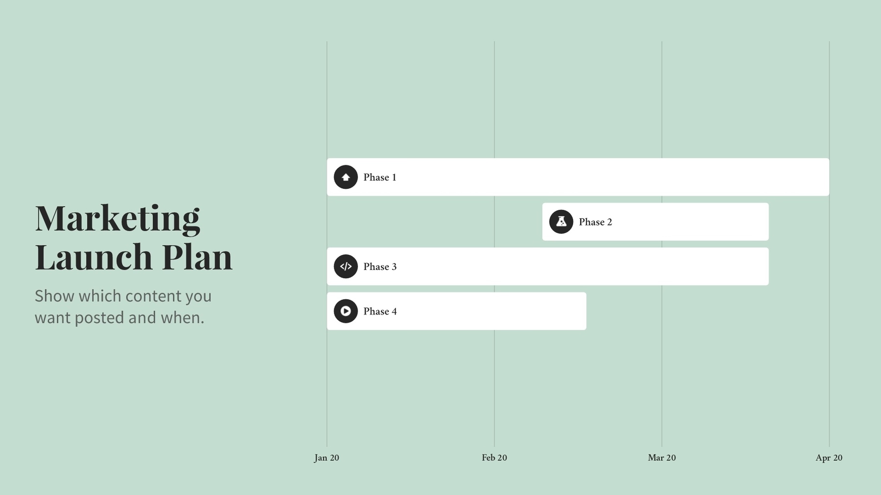
Depending on your content, you can change the axis to represent project time, or calendar time— days, week, months, or quarters. You can also turn grid lines on, or off, to fit your design preferences.
Don’t forget to set milestones where they make sense: deadlines required by clients or customers, when a new department takes over the next phase of the project, or when a long list of tasks is completed.

Create labels with optional icons
When used with a deliberate color scheme, labeling your tasks with its project owner will prevent confusion and make roles clear to everyone. Be sure to assign each bar on your Gantt chart to the appropriate person. This can also help ensure the workload is balanced.
For a more elevated design, you can select an icon or image for your labels and include relevant symbols or employee headshots.
Try a timeline or Kanban slide
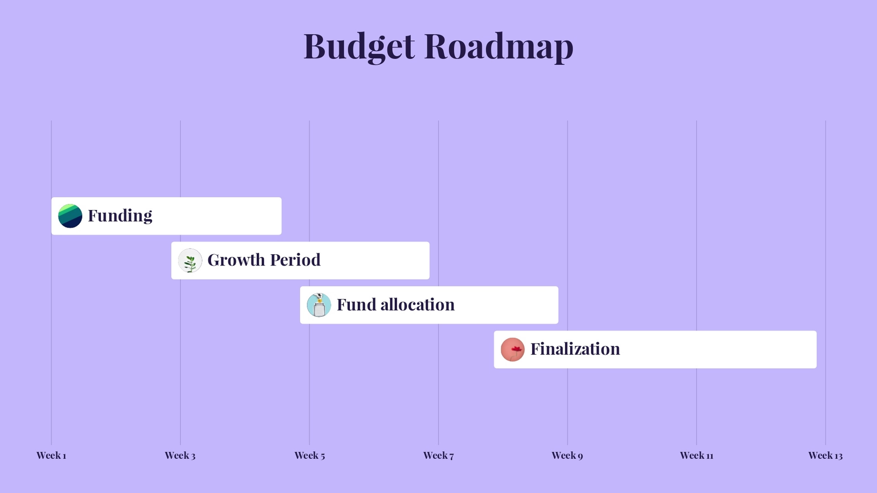
If the Gantt chart isn’t getting you exactly where you need the slide to be, you can try different variations of other slides. Our timeline or Kanban Smart Slide templates offer similar layouts ideal for project management that may allow you to customize in a way that makes more sense for your story.
Toggling between different slides is a low-stakes way to visualize your content in new ways without having to start over from scratch.

.gif)
.gif)



.gif)
.gif)

