It’s common for people— especially non-designers— to reach for the same, familiar presentation slide every time. Because they’ve used it time and time again, it takes away some of the guesswork in presentation design. And the repeatability makes the design process feel less overwhelming.
We’d be willing to bet that those same people gravitate towards a bulleted list. It’s easy to organize your content with little design lift, which makes it a safe slide option. There’s nothing wrong with a bullet slide, but we’re here to push you to think outside the box (or in this case, slide).
Instead of defaulting to a text-based presentation slide, leverage Beautiful.ai’s Smart Slide templates for inspiration and design automation. The smart technology handles the heavy lifting of design, automatically aligning and resizing content, so you have more freedom to explore different layouts— no design skills required.
5 Smart Slides you should be using in 2025
Smart Slides help you reimagine your story to reach your full presentation potential, driving bigger results.
These are 5 Smart Slides you should be using (if you aren’t already) to take your presentation design to the next level.
Dashboard
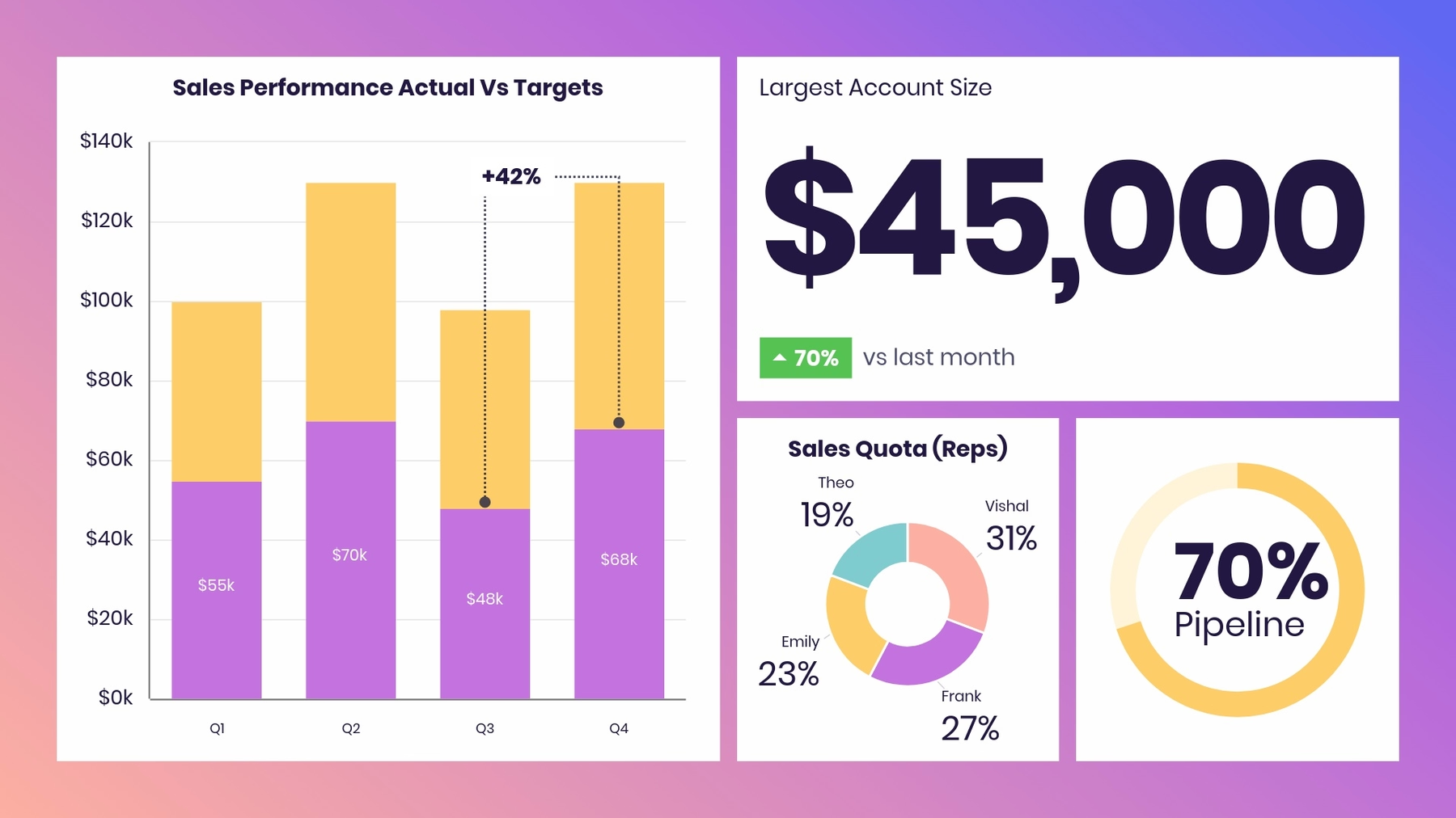
Sometimes one chart simply isn’t enough, and a bigger data dump may require multiple infographics on one slide to tell the full story. Beautiful.ai’s data dashboard Smart Slide lets you add, drag, resize, and position text, images, and charts with precision. This flexibility is perfect for designing data-rich slides that warrant more creative layouts. You can stack charts to compare growth over time, or mix-and-match cells to provide more context and call out key takeaways.
Use a data dashboard template to optimize data visualization, quickly identify trends and patterns in your data, and present more information on one single slide.

Arrow cycle
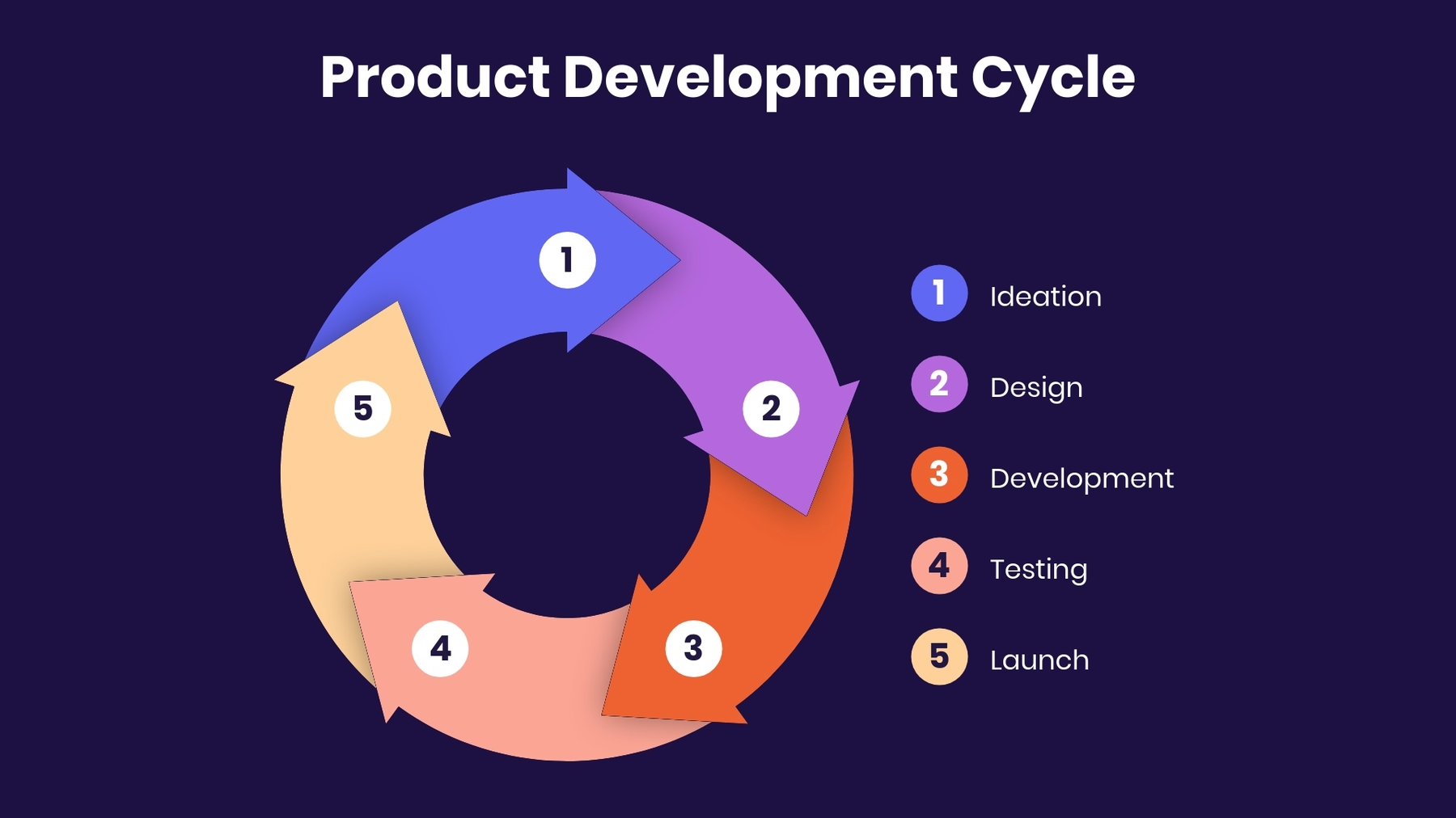
Simplify process mapping for better team alignment. An arrow cycle presentation slide template can be used to illustrate processes that repeat over time like the cycle of product development— from ideation to launch. Demonstrate how various components of a business interconnect, such as input, production, consumption, and feedback loops.
Use an arrow cycle template to showcase a business model at a bird’s-eye view, display a complex process in a clear, visual way, or align on processes for more successful execution.

Photo grid
While information you present in text is one of the most important elements in your presentation, your visual elements matter, too. Text alone isn’t enough to keep your audience’s attention and get your points across. You need a carefully chosen mix of graphics that will make an impact on your viewers.
A photo grid template can help your presentation tell a story visually without having to rely solely on text. You might use this template to show the faces behind a team of employees, share progress on a design or construction project, or cover important information in an onboarding presentation.
Use the photo grid template to add visual interest to your presentation, mix various types of content on one slide, or connect with your audience.

Gantt Chart
A Gantt chart is a visual view of tasks scheduled over time. Invented by Henry Gantt, an American mechanical engineer, it's a type of bar chart that shows the start and finish dates of several elements of a project that include: what the project tasks are, who is working on each task, how long each task will take, and how tasks group together, overlap, and link with each other.
Gantt charts are usually used for project management to track tasks and milestones, marketing planning to ensure deadlines are met, and product roadmaps to manage deadlines and deliverables.

Infographic
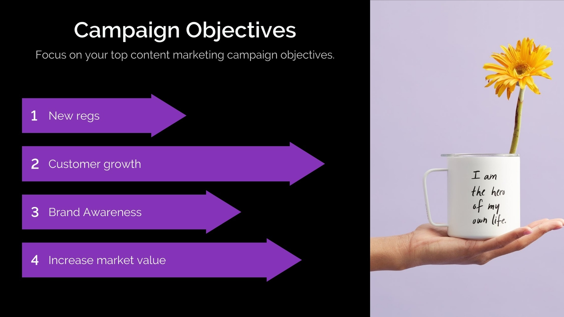
Need to dress up a plain list of data? An infographic presentation slide displays your data in an interesting, impactful way. Instead of adding a regular bullet list to a slide, an infographic slide uses arrow bars to organize your data. Arrows can imply relationships or movement between data points, explain steps to achieve a goal, or make any list in your presentation look well-designed.
Use our infographic slide template to share important data visually, lay out steps in a process, or show relationships between different data.


.avif)


